
After this morning’s mega-leak of Android 4.4 “Kit Kat” and the Nexus 5, we decided to do some comparison shots of the leak to the most current version of Android 4.3 running on a Nexus 4. If the differences weren’t immediately clear in that other post, this should help you see it all. From the new transparent background of the navigation buttons and notification area, to the new icons (and some missing) in the app drawer, there are actually quite a few changes. Sure, they are mostly subtle, but damn do they look good.

So in the top image and the one directly below, we are getting a comparison of the lock screens and the swipe action to quickly jump into the camera. As we mentioned before, you can see that Google has added a camera icon to the lower right corner to make it more obvious to everyday users that you can access the camera this way. From the leak, we know that you can grab the camera icon and slide it over, but can also swipe from the edge of the display as you have done in the past.
We’re also getting our first look at the new transparent notification bar and white icon set. Personally, I’m a fan of the white now that I’ve seen it next to the Android blue that has been a part of our lives for so long.
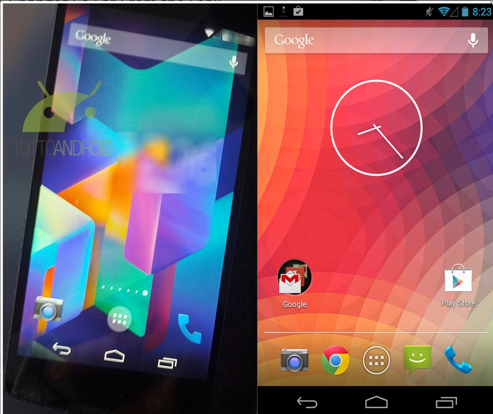
 In this next screenshot, we get a side-by-side comparison of the home screen setup. This is our first look at the transparent navigation button background, but we’re also seeing a new phone icon and launcher button. Google has also done away with the dock separator and instead gone with a home screen indicator set of dots. That wallpaper may be new to Kit Kat as well.
According to the leak, users can add as many home screens as they’d like and are not stuck with the 5 that Nexus devices have been locked to for some time. They even mentioned that the device may ship with only a few, but that you can add more later on. We aren’t sure if the Camera and Phone icons are the only ones that are going to be allowed in the dock or not, but that would be extremely disappointing if Google locked that area to these two and wouldn’t allow you to add in a folder or Gmail, for example.
The leak also mentions Google Now accessibility coming in two forms. The first, is your typical swipe-up from the Home button. But their source mentioned that if you are on the farthest home screen to the left, that another single swipe from the left will get you into Google Now. We imagine this being similar to what Motorola was doing with their quick toggles in Blur on devices like the Atrix HD and RAZR HD.

In the next comparison, we’re seeing the revamped app drawer, which also now has a transparent background. Missing are the Apps and Widgets buttons up top, so we’re not exactly sure how Google plans on handling widgets going forward. Hopefully, we see the long-press-to-add-from-home-screen return.
In other changes, we’re seeing the removal of Gallery, Local, Messaging, Movie Studio, and Navigation (Currents gone as well, but can be downloaded through Google Play). If Messaging is no longer a part of the experience, does that mean Hangouts will finally become the all-in-one messaging platform we were hoping it would become?
The grid size is back to a 4×5, but that more than likely has to do with the screen resolution than anything. The Nexus 4 carried a wider resolution than most, so we saw it switch to a 5×5 grid.
Last, there are new icons for Google Photos (formerly G+ Photos), Google Settings, and Google Search.

From the settings menu, the only real difference we are seeing here is the addition of a “Tap & pay” section. These was previously seen as “Payments” in another leak, so we’d assume this has to do with built-in NFC payment apps, more than likely Google Wallet.

And finally, we get a look at the new enhanced location settings menus. We can see that Google is going to give you the power to adjust location modes to either enhance accuracy or work less regularly to save battery life. They are also including a section for recent location requests and giving you quick access to location history.

This seems like quite a bit of change, but part of me gets the feeling that there is far more to see than what these pictures has shown us.

So in the top image and the one directly below, we are getting a comparison of the lock screens and the swipe action to quickly jump into the camera. As we mentioned before, you can see that Google has added a camera icon to the lower right corner to make it more obvious to everyday users that you can access the camera this way. From the leak, we know that you can grab the camera icon and slide it over, but can also swipe from the edge of the display as you have done in the past.
We’re also getting our first look at the new transparent notification bar and white icon set. Personally, I’m a fan of the white now that I’ve seen it next to the Android blue that has been a part of our lives for so long.
 In this next screenshot, we get a side-by-side comparison of the home screen setup. This is our first look at the transparent navigation button background, but we’re also seeing a new phone icon and launcher button. Google has also done away with the dock separator and instead gone with a home screen indicator set of dots. That wallpaper may be new to Kit Kat as well.
According to the leak, users can add as many home screens as they’d like and are not stuck with the 5 that Nexus devices have been locked to for some time. They even mentioned that the device may ship with only a few, but that you can add more later on. We aren’t sure if the Camera and Phone icons are the only ones that are going to be allowed in the dock or not, but that would be extremely disappointing if Google locked that area to these two and wouldn’t allow you to add in a folder or Gmail, for example.
The leak also mentions Google Now accessibility coming in two forms. The first, is your typical swipe-up from the Home button. But their source mentioned that if you are on the farthest home screen to the left, that another single swipe from the left will get you into Google Now. We imagine this being similar to what Motorola was doing with their quick toggles in Blur on devices like the Atrix HD and RAZR HD.
In the next comparison, we’re seeing the revamped app drawer, which also now has a transparent background. Missing are the Apps and Widgets buttons up top, so we’re not exactly sure how Google plans on handling widgets going forward. Hopefully, we see the long-press-to-add-from-home-screen return.
In other changes, we’re seeing the removal of Gallery, Local, Messaging, Movie Studio, and Navigation (Currents gone as well, but can be downloaded through Google Play). If Messaging is no longer a part of the experience, does that mean Hangouts will finally become the all-in-one messaging platform we were hoping it would become?
The grid size is back to a 4×5, but that more than likely has to do with the screen resolution than anything. The Nexus 4 carried a wider resolution than most, so we saw it switch to a 5×5 grid.
Last, there are new icons for Google Photos (formerly G+ Photos), Google Settings, and Google Search.

From the settings menu, the only real difference we are seeing here is the addition of a “Tap & pay” section. These was previously seen as “Payments” in another leak, so we’d assume this has to do with built-in NFC payment apps, more than likely Google Wallet.

And finally, we get a look at the new enhanced location settings menus. We can see that Google is going to give you the power to adjust location modes to either enhance accuracy or work less regularly to save battery life. They are also including a section for recent location requests and giving you quick access to location history.

This seems like quite a bit of change, but part of me gets the feeling that there is far more to see than what these pictures has shown us.


Thank you for you Approach , comment, info...
ReplyDelete